SHEA Website
About
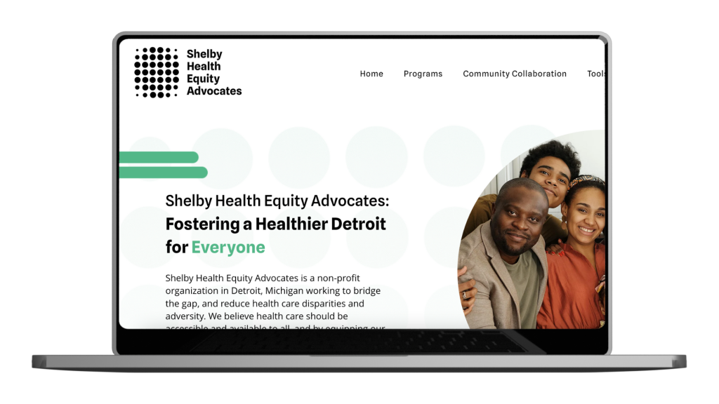
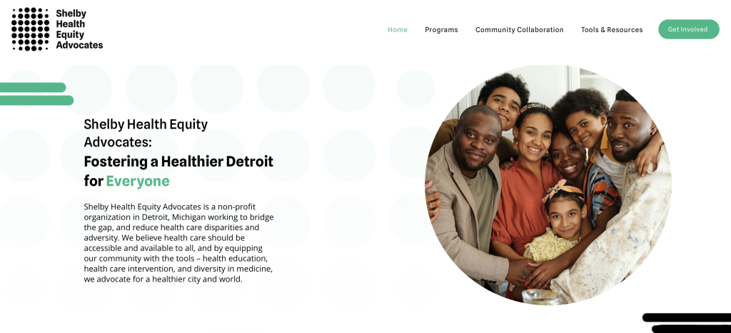
Shelby Health Equity Advocates is a non-profit organization in Detroit, Michigan working to bridge the gap, and reduce health care disparities and adversity. We believe health care should be accessible and available to all, and by equipping our community with the tools – health education, health care intervention, and diversity in medicine, we advocate for a healthier city and world.
Problem
Shelby Health Equity Advocates, needed a website to establish their online presence. They required a platform to showcase their mission, highlight events, enable user connections, and facilitate donations.
Solution
I designed and developed a website for Shelby Health Equity Advocates that effectively communicated their mission, provided information on events, allowed users to connect with the organization, and facilitated donations. The design was focused on being visually appealing, user-friendly, and informative.
Tools
- Design Software: Figma
- Development Tools: HTML, CSS, WIX
- Project Management: Click Up
Team
- Project Manager: Resonance Strategies
- UX/UI Designer & Developer: Briana White
My Role
As the UX/UI Designer and Developer, I was responsible for the complete design and development of the website. This involved conducting user research, creating wireframes and high-fidelity mockups, and implementing the design.
Timeline
- Research & Planning: 2 weeks
- Wireframing & Prototyping: 2 weeks
- Design & Development: 4 weeks
- Testing & Launch: 2 weeks
My Design Process
My design process involved continuous iteration, starting with user research, followed by wireframes, prototypes, and optimization, with constant refining and redesigning to achieve the final design.
User Research
For the SHEA website, we conducted research by gathering opinions from industry professionals and the target audience. This involved analyzing feedback on user expectations and preferences to inform the design process. We focused on understanding what elements would be most valuable for users and how best to present SHEA’s services online.
This research provided critical insights into the needs and preferences of both industry experts and potential users. It guided our design choices, ensuring that the website would effectively meet user needs and establish a meaningful connection with SHEA’s audience.
Competitive Audit & Analysis
We performed a competitive analysis to understand how similar organizations in the health equity sector present their services online. This audit involved examining successful design elements and strategies used by competitors. The goal was to identify best practices and ensure SHEA’s website would stand out while incorporating effective design features.
The insights gained from this analysis informed our design strategy, helping us create a website that was both distinctive and aligned with successful industry practices. This approach ensured that SHEA’s online presence was engaging and effective.
Ideation
Website Architecture
The website architecture was designed to enhance user navigation and content accessibility. We organized the site into key sections, including services, community collaboration, and contact information, to facilitate easy access to important content. The layout was crafted to ensure a logical flow and a seamless user experience.
This structure was designed to establish a solid online presence for SHEA, making it straightforward for users to find and engage with the organization’s content. The architecture supports SHEA’s mission by providing a clear and functional platform for connecting with their audience.
Priority Features
The website features a prominent homepage that highlights SHEA’s core services and upcoming events. An community collaboration page was included to keep the community informed about SHEA’s activities. Additionally, a user-friendly contact form was integrated to encourage interaction and engagement.
These features were chosen to ensure that the website effectively communicates SHEA’s mission and provides a smooth user experience. The focus was on creating a functional and engaging site that supports SHEA’s outreach and community engagement goals.
Design
Wire-framing & Prototyping
We began the design process with wireframes to outline the basic structure and layout of the website. These wireframes were then developed into high-fidelity prototypes, incorporating visual design elements and interactive features. Prototyping allowed us to test and refine the user experience before finalizing the design.
This approach ensured that the website was both visually appealing and user-friendly. The prototypes were instrumental in validating the design and making necessary adjustments to meet user needs effectively.
Optimize
Testing & Iteration
Usability testing was conducted to gather feedback on the website’s functionality and overall experience. We observed how users interacted with the site and collected their input on areas for improvement. Based on this feedback, we made several iterations to enhance navigation, address usability issues, and optimize performance.
This iterative process was essential in refining the website, ensuring that it met user expectations and effectively supported SHEA’s objectives. The final design reflects a thorough and user-centered approach, providing a solid foundation for SHEA’s online presence.
Results
- Established Online Presence: Successfully created the first online presence for Shelby Health Equity.
- Enhanced User Engagement: Clear information architecture improved user navigation and engagement.
- Facilitated Donations: Easy-to-use donation feature increased the number of contributions.
- Positive User Feedback: Users reported a user-friendly and informative browsing experience.
Final Thoughts
Creating Shelby Health Equity’s first website was a significant milestone for the organization. By focusing on user-centered design and modern aesthetics, I developed a site that effectively supports their mission, showcases events, and facilitates user engagement and donations. The collaboration with Resonance Strategies ensured a smooth project management process, leading to a final product that exceeded client expectations. This project laid a strong foundation for their digital presence and future growth.